
"Sakana", a sushi delivery app
Project Brief
Brief of the project, problems, goal, my role and responsibilities
Product : Sakana (A sushi delivery app) Project Duration : January - March 2022
This project is to create an app where users can learn about sushi and order online / reserve tables at a sushi restaurant. This Idea was brought up when my friend and I were eating at a sushi restaurant. My friend was new to sushi and created a sushi app that is designed for new users to learn about sushi and look for a good restaurant to eat at. This is the first UX project that I have done from start to finish and I am excited to show you what I created! I was responsible for conducting user research, creating a persona, and designing the app. It was a great journey to show my skills and practice what I learned.
Problem / Goals
Problem: Some users lack knowledge about sushi and commuters lack the time to prepare a meal.
Goal: Design an app for sushi that allows users to easily order and learn more about the type of food their eating.
My Role and Responsibility
My Role: UX designer designing an app from conception to delivery.
Responsibilities: Conducting interviews, paper, and digital wireframing, low and high-fidelity prototyping, conducting usability studies, accounting for accessibility, and iterating on designs.
User Research
Interview Details, Pain Points, Empathy Map, Persona
Interviewing the participants
Before creating a prototype of the app, I need to learn how users feel about sushi and get into the participant's shoes. To achieve empathy, first I needed to interview.
A. 4 Participants
B. Chose people who go to sushi restaurants often and had ordered online before.
C. Asking questions, for example, about challenges the user faced when ordering at the sushi restaurant, Like and dislikes when ordering sushi online, and more
Pain Point
Knowledge
Majority of users love the food but have less knowledge about the food. So often users eats sushi but do not know what is about
Accessibility
There was not enough platform that inform users details about sushi
Expectation
Often users look up sushi, but often getting a meal that they did not expect. (E.g portion size)
Empathy Map
By creating an empathy map, I can deep dive into users' points of view and analyze data to create insights. This empathy map is divided into 4 sections. Thinks, Feels, Does, Says.
- Thinks / What users think about sushi, ordering ext
- Feels / What users feel
- Does / What users do
- Says / What users say
Creating Ideas for big / close up storyboard
I created a storyboard to make it easier to understand where the users specifically need the app or how users would use the app. Creating it makes it easier to understand a point of view from the user's perspective, achieving empathy.
Big storyboard: In what situation do users use the app
Close up Storyboard: Specific app features users use.
After Interview....
It was my first time conducting the interview one-on-one and there were some successes but also a lot of mistakes. For example, because I talked to my participants in a casual way, I forgot to ask the main questions. Also at one point, I was not leading the conversation, which made my participants worried. It was a great opportunity to learn about interviewing, however, I could have done more.
Designing the app / Part 1
Paper Wireframe, Digital Wireframe, Usability testing

Paper Wireframe
After discovering pain points and following the user journey (where users have a goal they want to accomplish and steps to take in order to achieve the goal), I created a paper prototype. User in mind, I created from Home screen -> Details of sushi -> Look for restaurant -> Order sushi
First Paper...Next Digital!

Digital Wireframe
I took time to create each screen with the user in mind. From the Home screen to the ordering screen, I used Figma to create a digital wireframe. I prioritize large icons, to expand on easy order and accessibility. More details on the wireframe will be on the button below and two sections

Digital wireframe Examples 1/2 (Home Screen)
While creating the digital wireframe, I made sure to make the icon and buttons bigger, to make it easier to order and diverse of people can enjoy the app.

Digital wireframe Examples 2/2 (About Sushi Screen)
I made the design clear and consistent because that was a great way to achieve accessibility.
Before Moving on....
Before creating a low fidelity prototype, I needed to test my design to see if there is any concern, design changes I need to make before moving on. So I did a usability test on the same 4 participants I interviewed before. And below are the findings.
Usability Test
I conducted three rounds of usability studies. Findings from the first study helped guide the designs from wireframes to mockups. The second study used data I collected from the first study and revealed what aspects of the wireframe needed refining.
First Study
-
Can not figure out the home screen. There was some confusion on the home screen because there is no sense of direction. Participants are more curious about other buttons because there was no text.
-
Confused about ordering. After looking at the detail page, participants were confused about reserving and ordering
-
No confirmation page. On the last page, there was no confirmation page, which made the participants concerned. Comment: After the first study, I fixed the major problem the participants had, and also I fixed other functions as well.

Second Study
The side menu disappears when going on a different page. On the home screen, there is a side menu that disappears when going to the next page. Participants were confused about the purpose of it.
Cart icon should be on the screen at all times. Suggested to add the cart on the top right, and not after ordering. To let the users know online order is available.
No cancel order option. There was no cancel option when ordering.

Design the app / Part 2
Low Fidelity, High Fidelity Usability Test
Low Fidelity Upgrade
This is one example of a low-fidelity upgrade. (Home Screen) After some users were confused on the home page, I added some details with large icons, so it is easy to see. I added a horizontal menu for more access to the app. Move the profile to the bottom and add a cart on top since users were confused about where to access it.


One last check...
Making the design great and functional, first to test and get feedback for my design. I let users to use the app and I instructed them to comment on changes I should make or suggestions.
Feedback and suggestions (accessibility)
Bigger text and icon
The text was too small or not bolded so users had a hard time understanding the meaning of the text. Also for the icons, there were too many icons in places, (for example, horizontal menu) that it was hard to see it. So I made adjustments to text and icons to be more visible or eliminate the unwanted icons.
Too bright
This is the most feedback that I got was the color. The color that I chose for my "main color" (for the app) was too bright that it was distracting for the users. After testing out the colors, I made the color navy blue to be darker and less distracting for users.
Contrast
The use of the color on buttons and other functions made the app not easy to use. It was hard to determine which buttons can be used or not, so I created a color contrast to make the buttons to make it more appealing and easy to differentiate.
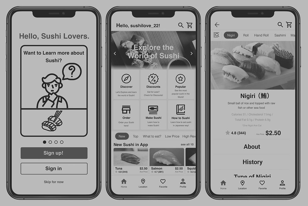
High Fidelity Upgrade
This is one example of a High-fidelity upgrade. (Home Screen) After the feedback, I change the text size and icons to be more visible, toned down the colors, and create contrast so the users can easily identify the buttons.

Outline and User Jourey
This is the overall outline of the High fidelity prototype. I made the buttons functional and users can go back to the previous page. I added some animation and additional features to make the app run smoothly and make it more "life-like".The user journey is from signing up/ login into the app, the user discovering sushi, looking for a restaurant that serves it, and reserving seating in the restaurant.

Final Design of the Project
Images, High Fidelity, Prototype


Going forward
Take aways, Contact
Take Aways
Impact
Users were satisfied with the app and how each usability test improve the design significantly.
Quote from users : "I wish they have this app so I can recommend this to my other friends, best for sushi lovers"
What I learned
I learned how important user feedback is. This is my first-time getting user feedback, so I was nervous about showing my work. However, from that, I learn so much about how the design can be improved, and it was an eye-opening experience.
Next Step...
1. Creating more features in the app to create full scale app
2. Do more usability test to improve more design and learn
3. Study more about user experience and learn new skills to become a better user experience designer